In the 21st century it is hard to express your own voice through written language. Unless if you are handwriting all your e-mails, thesis papers and Instagram DMs; our written communication is conveyed by a font designed by a typeface designer. While typeface designers are often grandmasters of their craft, it removes the personal element of communication. Written text doesn’t carry my voice, nor does it carry the shapes and quirks of my personal handwriting.
As such, I decided to design my own typeface. A font that can carry my voice in the digital age. A typeface that embodies how I wish to communicate: compact, legible, no frills and suited for both online and offline media.
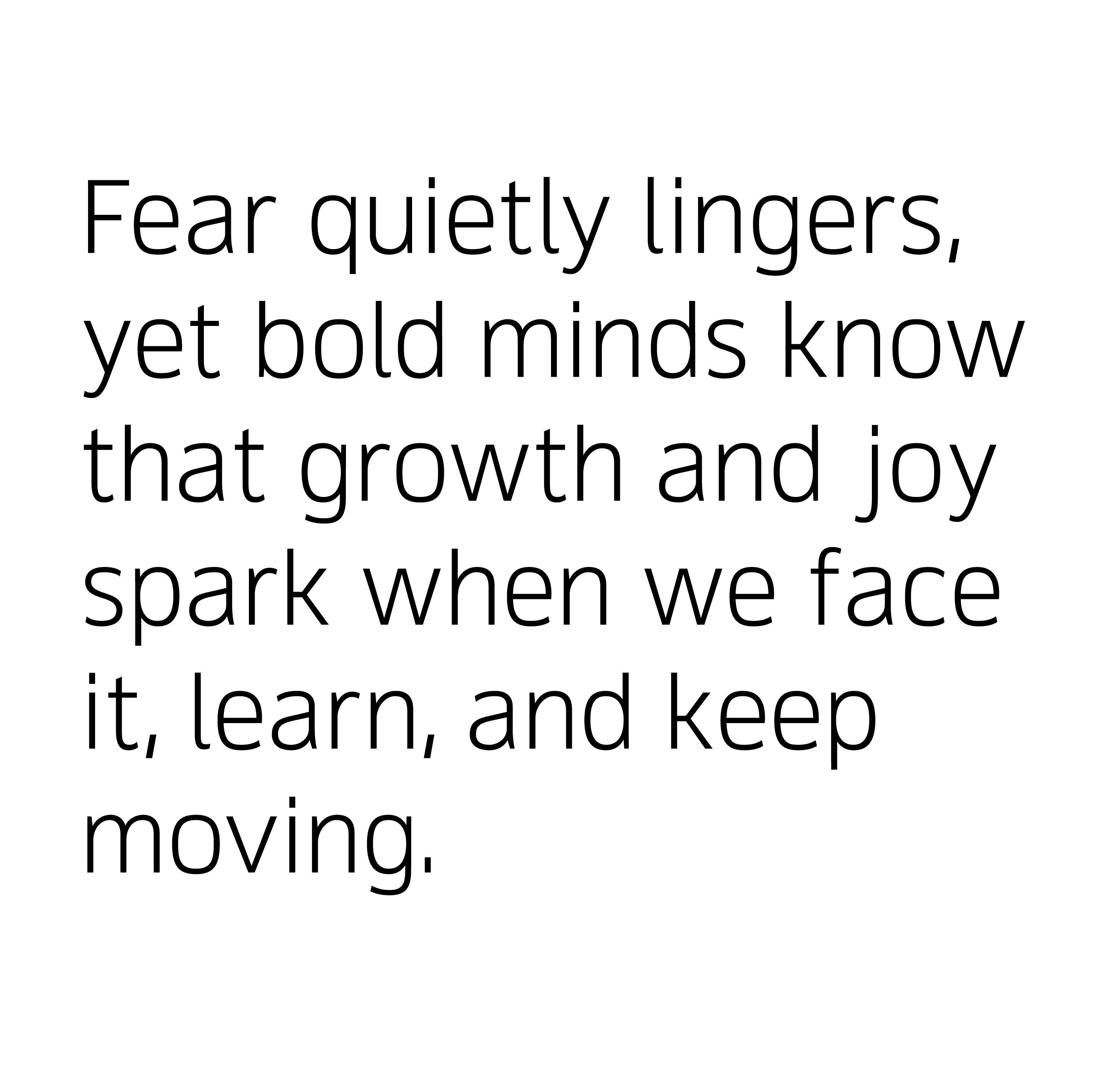
When I set out to develop “Sans Soucis”, I had the intention of creating a highly legible typeface with a personality. The difficulty turned out being balancing “personality” and “legibility”: improving on one usually meant deteriorating the other.
In the end, the push for legibility is the very thing that became its character: squat curves, large open counters and an increased x-height

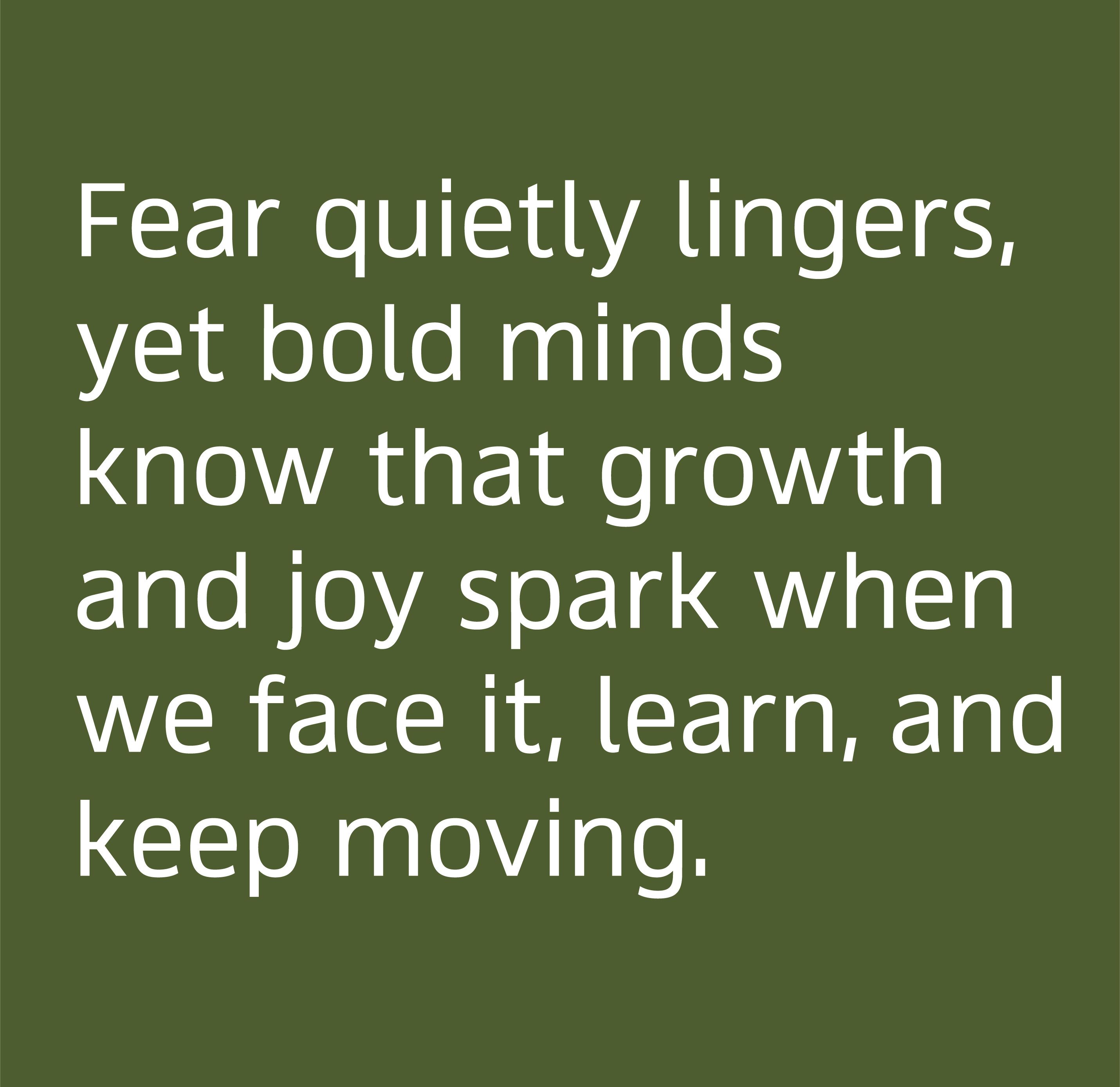
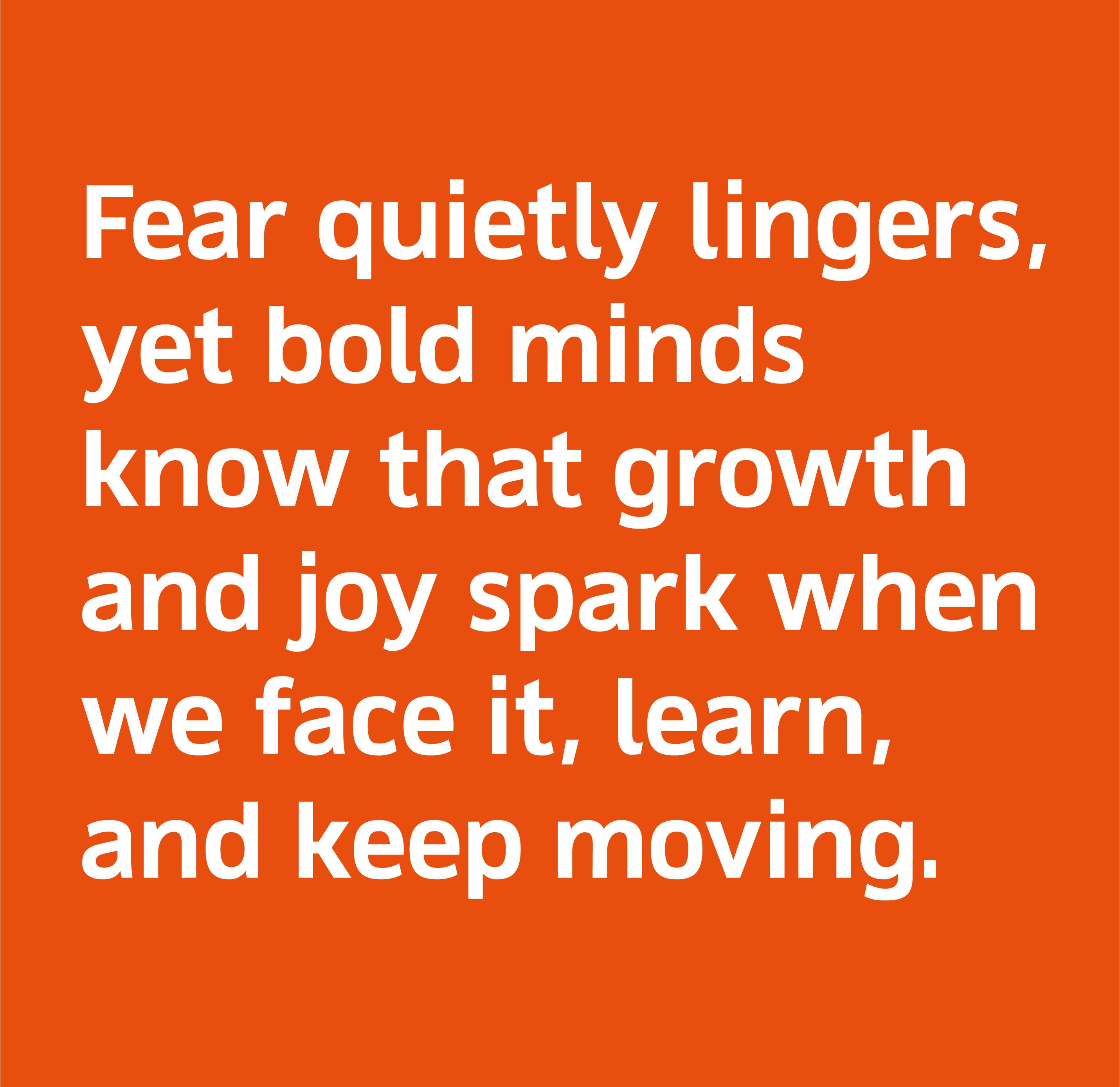
Sans Soucis is continuously a work in progress. However after almost 2 years I’m happy to say that with its 840 glyphs divided over 4 weights it is a typeface that I am more than happy to use in my personal communication. Including all body texts on this website.